Krueger Beer Variations: 1950-1959
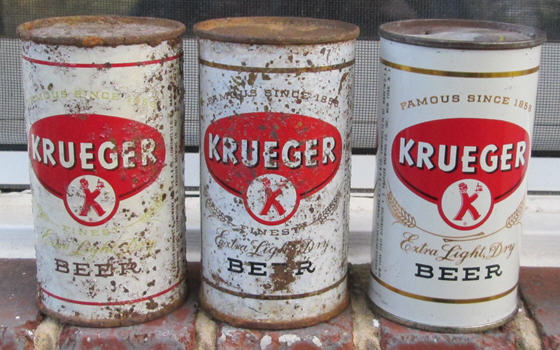 |
This month I want to show off an often-overlooked variation on a 1950s Krueger Beer, at center in the photo above. It's 90-18 in the USBC but it's much harder to find than the unlisted can I label below as 90-18b. It's on the right in the photo.
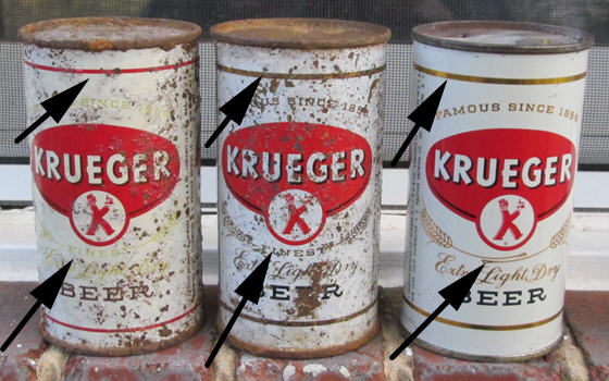
Below is the same photo with arrows pointing to the keys areas: the stripe around the label and the area right under the red K-Man. The differences are small. The first can had a red border and the word "FINEST" right under the red K-man. The lettering is also an enamel yellow rather than gold.
The middle can has a gold border and the word "FINEST" under the K-man.
The third can has a gold border, but does not have the word "FINEST." The middle can is the tough one to find. I've checked several hundred examples of the third can hoping to find one with the word FINEST. Finally, just this past October, I saw one on eBay. Apparently no one else noticed that it was the rare version because I won it for the opening bid of 99 cents.
 |
Krueger's 1950s Redesigns
OK, so what is the significance of this small variation? It's part of the constant label redesigns that Krueger did throughout the 1950s. They averaged a new can design once a year starting in 1950 and continuing into the early 1960s. Some of the changes were big; some, like the one above, were small, but they redid their design over and over again. It's unclear why. It could possibly be a reaction to a shrinking market share as the regional brewery competed with the increasingly powerful nationals--Anheuser-Busch, Pabst and Schlitz. On the other hand, Krueger had its best sales year ever in 1953. They did not start to lose market share until after that high point so many of the label changes came before their decline began.
Moreover, Krueger was not the only brewery to do lots of redesigns. Ballantine, another New Jersey brewery, made almost as many changes in the 1950s. The brewery trade magazines of the time reported scores of new label designs as breweries tried to make their labels more "modern" or "eye-catching." Some breweries even issued cans in multi-colored sets to catch customers' eyes. I've shown several of these on this site before-- including Drewrys' horoscope cans, Gretz's sports cars, and the gigantic Rainier Jubilee set.
Krueger also made many changes to their Ale labels, although not every small variation in the Beer labels also exist for the Ale cans. However, there are a few unique Ale variations that I will cover another time.
A note on sources
There are several sources that can help you tell when a case was issued. American Can Company (CanCo) used a tiny dating code on their cans from 1935-1953. Some breweries used a date code on their can lids (alas, Krueger was not one of those). Newspaper ads are also very useful, although you have to be careful as the commercial artist that created the ad may have taken a few liberties with the label, so you can't use them to look for variations as the "variation" may have only existed on the drawing table. Ads using photos are better, but they may not reflect recent label changes. Of course black and white ads are useless for spotting color variations.
Brewery journals often reported major label changes. They seemed to have had a short lead time before publication, so a story about a brewery using a new design may help you date a new label to within a few months of its release. The journals also often reported on new advertising campaigns, which would sometimes feature new label designs. Finally, on occasion a brewery made a big deal in the local press about a new design and you can find stories about it newspapers. You can see an example for Gunther Brewing in my October 2006 COM.
For the dates below I am using the CanCo codes, trade journal stories, and a few newspaper ads. Note that the USBC numbers are out of order if I put the cans in their correct chronological sequence. There may be other, small variations that I am not aware of that fit in this sequence. If I learn of any I will add them to this page.
Krueger Beer Cans: 1950s
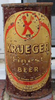 |
1950USBC: 90-14 This is the design Krueger started using on its cans in 1947 when canning started again after World War II. (Bottles started using it in 1945). In 1950 labels dropped the Internal Revenue Tax Paid statement (IRTP) so this is a non-IRTP can. This was a very short-lived example, as it was replaced that same year with the next design. As a result, this non-IRTP can is very hard to find, while the IRTP version is very common. I've dumped a lot of the IRTP cans, but never one of the non-IRTP. |
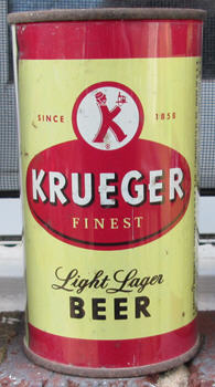 |
1950-51USBC: 90-15 Note how radically different this color scheme is from the previous design. There are two variations of this can. The first, 90-15, has a black accent line under 'FINEST" and "BEER" is in black, while 90-16 uses brown. This design lasted about a year, maybe a little bit longer. It is not rare. This example was made by Continental Can, not American Can, which is unusual. Krueger mostly used American Can products. (Source: brewery journals) |
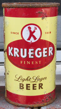 |
1950-51USBC: 90-16 This one has a brown border and was made by American can, so the difference in colors is probably just from the different companies using different shades of paint. The one with the black stripe (above) is much harder to find, suggesting that Krueger still relied on American can for most of their supply. Mine has a 1949 date code on it. Since these cans do not have the IRTP statement required before March 1950, It was probably produced in late 1949 in preparation for a roll-out of the new design the next year. (Source: can code and brewery journals) |
| I am not 100% certain of the sequence of the next three cans below, but I think the order makes sense if you assume the designers were generally making changes in at least a somewhat orderly fashion. | |
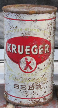 |
1951USBC: 90-17 A radical redesign. However, placing this can next in the sequence makes sense because the design keeps the red border, preserving at least some of the color scheme from its predecessor. It also keeps the word "Finest" from the previous design. (Source: Brewery journals. The canning code is not visible on my example because of a rust spot.) |
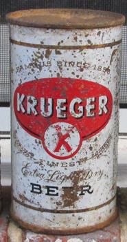 |
1952USBC: 90-18 The red accent border disappears but the word "Finest" remains. (Source: can code) |
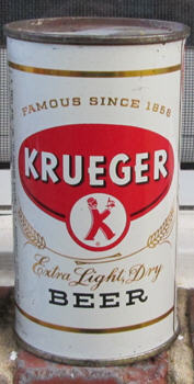 |
1952USBC: 90-18b The word "Finest" disappears and does not reappear on the remaining label redesigns. (Source: can code) |
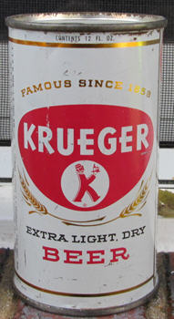 |
1952USBC: 90-20 They move the K-Man's circle entirely into the shield on the front and change the word "BEER" to red. The black accent line in the shield disappears. (Source: can code and brewery journals) |
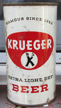 |
1953USBC: 90-21 The K-Man is now in black, making him stand out a little more. (Source: can code and brewery journals) |
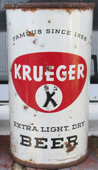 |
1954USBC: 90-22 The word "BEER" is now in black. This example does not have a can code on the side, indicating that it was made post-1953.
|
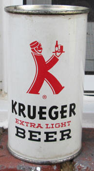 |
1954-56USBC: 90-19 This label kept the red/white color scheme but it really emphasizes the K-Man. A story in the trade press about this new label appeared in December 1954, so it appeared late that year. (Source: brewery Journals)
|
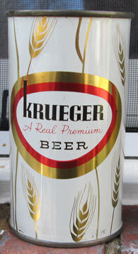 |
1956-1958USBC: 90-24 A radical redesign. They have shifted from emphasizing "Extra Light" to it being a "Real Premium" Beer, thus setting it apart from cheaper "popularly priced" competition This is also the last Krueger design to appear on a quart can. The previous Ale quarts were pre-1950 and the previous beer quart matched 90-15,16 from 1951. Was this an attempt to recapture lost market share? The quart cans with this design are among the hardest to find of the post-war Krueger cans. (Source: brewery journals and newspaper ads)
|
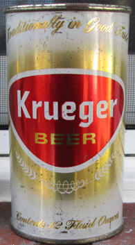 |
1959USBC: 90-23 This is the first can that was filled by both the Krueger Brewery in Newark (closed 1961) and the Narragansett Brewery in Cranston, Rhode Island (doing business as "Krueger") starting in 1961. This is also the last can design out of Krueger's Newark plant. The cans that came after this one came only from the Cranston brewery. This label may have appeared in late 1958 although I have found ads showing the previous design as late as November 1958. (Source: newspaper ads)
|
So, here they are, the dozen Krueger Beer flat tops of the 1950s.

